Bring out the best in your photos by correcting exposure problems using the Shadows & Highlights tool.
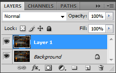 First, this tool doesn’t come as an adjustment layer yet, so you should duplicate your image: Ctrl+J (Win) or Command+J (Mac). This way you’ll be able to work on the image and, if you need, revert back any time. So, we have our duplicate. Let’s get to work on it.
Second, open up the Shadows/Highlights adjustment: Image > Adjustments > Shadows/Highlights…
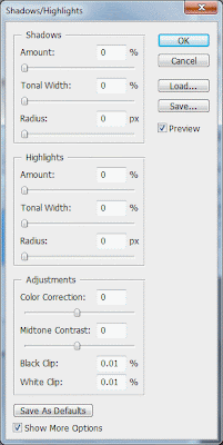 At the bottom of the adjustment window you’ll see a Show More Options checkbox. Make sure it’s checked. The additional options may look a little complex to first-time users, but we’ll go over them now. And trust me, you’ll appreciate the controls.
Our third step is optional. This is what suits me. There are default values set that come with Photoshop. These are unnecessary as you’ll use different values for each image you process. I like to start my work with a clean slate so I suggest to set the Amount, Tonal Width, and Radius for both the Shadows and Highlights to 0 (all the way to the left). Set the Color Correction and Midtone Contrast in the Adjustments box to 0 (that’s in the center). Next, hit the button at the bottom, Save as Defaults. Now every time you open Shadows/Highlights you’ll have it set with no changes to the image.
You should see three sliders within both the Shadows and Highlights sections. We’re going to work with the Shadows sliders first.
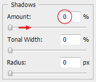
Pretty self explanatory—this is how much you’ll affect the image. (It’s also the lone visible slider when the Show More Options checkbox is not selected.) This is where you’ll lighten the shadows or darken the highlights respectively in the Shadow or Highlight sections. This slider paints with a wide brush. I doubt you’d ever want to use it alone. We’ll refine it with the next two sliders.
Tonal Width
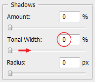 Here we define how much of the tonal range will be affected. Leaving the slider closer to 0% will mean only the darkest of the dark shadows will be affected. Increasing the percentage, sliding to the right, will start to affect more of the midtones.
Radius
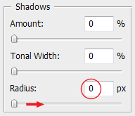
>The radius slider will determine how the adjusted areas blend with the rest of the image. You’ll want to input a value above 0px—if not it’ll leave the image looking a little grey and washed-out. You’ll see how this slider really affects the image quite nicely. Values from 3-15px, more or less, add real crispness—a nice harshness—to the image. This look I really like. Around 20px and above the effect blends or blurs much more discreetly in the image. The higher you go, the more it blends.
The Midtone Contrast slider can be used to increase or decrease the midtone contrast. Nice and simple: aptly named this time. Again, I do the same as I did with the Color Correction slider, this time returning the contrast to how it looked originally.
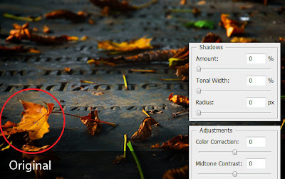
In the picture above, after making adjustments to Shadows, I readjusted the Color Correction and Midtone Contrast sliders to make the leaf (circled) look as similar to the original as possible. (No changes were made in the Highlight section.) After correcting the Shadows/Highlights, I can work more specificially on the Hue/Saturation or customize the image with other adjustment layers.


Introduction
Today we’re going to take a look at an incredibly useful, amazing tool: the Shadow and Highlight adjustment. Often when taking pictures, it’s difficult, sometimes impossible, to get perfect exposure on everything within the frame. Especially shooting outdoors with a bright sun and shadows on the landscape you’re bound to over—or under-expose parts of your shot. The Shadow/Highlight adjustment is another great tool to help you maximize the potential of your shots.let’s take a look.Shadow and Highlight
Overview First, this tool doesn’t come as an adjustment layer yet, so you should duplicate your image: Ctrl+J (Win) or Command+J (Mac). This way you’ll be able to work on the image and, if you need, revert back any time. So, we have our duplicate. Let’s get to work on it.
Second, open up the Shadows/Highlights adjustment: Image > Adjustments > Shadows/Highlights…
 At the bottom of the adjustment window you’ll see a Show More Options checkbox. Make sure it’s checked. The additional options may look a little complex to first-time users, but we’ll go over them now. And trust me, you’ll appreciate the controls.
Our third step is optional. This is what suits me. There are default values set that come with Photoshop. These are unnecessary as you’ll use different values for each image you process. I like to start my work with a clean slate so I suggest to set the Amount, Tonal Width, and Radius for both the Shadows and Highlights to 0 (all the way to the left). Set the Color Correction and Midtone Contrast in the Adjustments box to 0 (that’s in the center). Next, hit the button at the bottom, Save as Defaults. Now every time you open Shadows/Highlights you’ll have it set with no changes to the image.
Amount, Tonal Width, and Radius
You should see three sliders within both the Shadows and Highlights sections. We’re going to work with the Shadows sliders first.
Amount

Pretty self explanatory—this is how much you’ll affect the image. (It’s also the lone visible slider when the Show More Options checkbox is not selected.) This is where you’ll lighten the shadows or darken the highlights respectively in the Shadow or Highlight sections. This slider paints with a wide brush. I doubt you’d ever want to use it alone. We’ll refine it with the next two sliders.
Tonal Width
 Here we define how much of the tonal range will be affected. Leaving the slider closer to 0% will mean only the darkest of the dark shadows will be affected. Increasing the percentage, sliding to the right, will start to affect more of the midtones.
Radius

>The radius slider will determine how the adjusted areas blend with the rest of the image. You’ll want to input a value above 0px—if not it’ll leave the image looking a little grey and washed-out. You’ll see how this slider really affects the image quite nicely. Values from 3-15px, more or less, add real crispness—a nice harshness—to the image. This look I really like. Around 20px and above the effect blends or blurs much more discreetly in the image. The higher you go, the more it blends.
Adjustments
We’ve come to the last two sliders: Color Correction and Midtone Contrast. The Color Correction slider should really be called a Saturation slider as its sole function is to increase/decrease saturation. I use it to readjust the saturation to what it looked like before the Shadow and Highlight adjustment. Further saturation adjustments I prefer to do with an adjustment layer that can be altered more easily.The Midtone Contrast slider can be used to increase or decrease the midtone contrast. Nice and simple: aptly named this time. Again, I do the same as I did with the Color Correction slider, this time returning the contrast to how it looked originally.

In the picture above, after making adjustments to Shadows, I readjusted the Color Correction and Midtone Contrast sliders to make the leaf (circled) look as similar to the original as possible. (No changes were made in the Highlight section.) After correcting the Shadows/Highlights, I can work more specificially on the Hue/Saturation or customize the image with other adjustment layers.
Examples
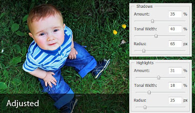
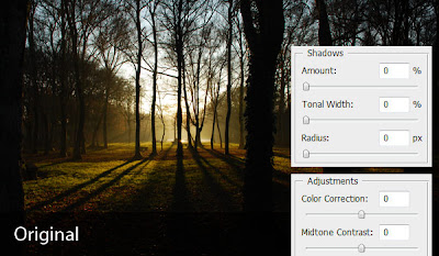
Image adjustments are up to the editor’s preference. So there’s no right or wrong way to do this. Nonetheless, here are a couple examples of pictures optimized with Shadows/Highlights. I’ll put my settings alongside the images, so you can see what I did. Try using this tool yourself. I think you’ll find that this is a great tool for optimizing your images and making little fixes that may make the difference between a good picture and a great one.